
Websites and SEO
What Makes a Website Look Cheap—and How to Fix It
The Small Design Mistakes That Make a Business Look Less Legit Than It Actually Is

You can spend $5,000 on a website and still end up with something that looks cheap.
You can also build a relatively inexpensive website and have people assume you paid a professional a whole lot more than you actually did.
The difference usually is not the price tag.
It is the details.
A website starts looking cheap when it feels like nobody made any real decisions. Five fonts are fighting for custody of the headline. Everything is a different shade of blue. The stock photos look like they came free with Microsoft Office in 2007. Every section is screaming for attention. The mobile version appears to have been abandoned by its family.
None of that means your business is cheap.
It means your website is accidentally making your business look that way.
And thankfully, most of the things causing it are fixable.
1. Everything on the page is screaming
One of the fastest ways to make a website look amateur is treating every single thing like it is the most important thing on the page.
The headline is huge.
The button is huge.
There is another button directly underneath it.
Three badges are glowing.
Something is blinking.
There is a popup covering half the screen.
And apparently every sentence needed to be bold.
Your visitor should not have to solve a puzzle to figure out where to look first.
A professional-looking website has a clear visual hierarchy:
- one main headline
- supporting copy underneath it
- one obvious primary action
- clear section headings
- body text that is easy to read
- secondary information that actually looks secondary
If everything is important, nothing is important.
Fix it: Decide what you want someone to notice first, second, and third. Use size, spacing, placement, and contrast to guide them there instead of making every element compete for attention.
2. You are using too many fonts
I love fonts.
I also love buying fonts I absolutely did not need because apparently that is one of my hobbies now.
That does not mean they all belong on the same website.
Using four, five, or six unrelated fonts almost always makes a site feel less polished.
For most small-business websites, you can build an entire design system with:
- one strong display or heading font
- one highly readable body font
- possibly one accent font used very sparingly
That is it.
You also need consistency. If every section heading randomly changes size, weight, capitalization, or style, your site starts feeling assembled instead of designed.
Fix it: Pick a small typography system and use it everywhere. Your H1 should look like an H1. Your H2s should match one another. Buttons should match. Body copy should not randomly switch fonts because you got bored halfway down the page.
3. Your spacing is all over the damn place
This is one of those things people who are not designers may not immediately be able to name—but they absolutely feel it.
A heading is practically sitting on top of one paragraph.
The next section has enough empty space to park a Honda Civic between the headline and the copy.
Three cards have different padding.
Buttons are floating at slightly different heights.
The whole page feels vaguely wrong.
Consistent spacing is one of the biggest differences between something that looks homemade and something that looks professionally designed.
Fix it: Create a simple spacing system and repeat it. Use consistent gaps between headings and paragraphs, consistent padding inside cards and buttons, and consistent vertical space between sections.
You do not need to measure every damn pixel with a ruler. You just need the design to feel intentional.
4. Your website has every color you have ever liked
Your website does not need to demonstrate that you know the entire rainbow exists.
Too many colors can make an otherwise decent website instantly look cheaper.
This usually happens when somebody starts with two brand colors and then keeps adding:
- a different color for buttons
- another one for headings
- a random gradient
- three shades from an old logo
- something neon because it looked cute
- whatever color the template came with
Now the brand looks like seven different businesses signed a lease together.
Fix it: Build a controlled palette. You typically need:
- a primary brand color
- a secondary or accent color
- a background color
- a main text color
- one or two supporting neutral shades
You can absolutely use more sophisticated palettes, but every color should have a job.
5. Your images are blurry, stretched, random, or painfully stock-photo-ish
Bad imagery can destroy an otherwise good website.
If your photo is 400 pixels wide and you stretch it across an entire desktop screen, we can tell.
If every employee in your “team” photo looks suspiciously like they have never met each other because they came from six different stock-photo shoots, we can tell that too.
And if your homepage has a woman laughing alone at a salad for absolutely no identifiable reason, I am going to have questions.
Fix it: Use fewer, better images.
Choose visuals that:
- actually relate to the business
- have a consistent visual style
- are large enough for where they are being displayed
- are cropped intentionally
- do not look distorted
- are properly compressed so they do not murder your page speed
If you have real photos of your work, products, process, location, or yourself, those will often build more trust than another perfect stock model pointing at an invisible graph.
6. The copy sounds like everybody else's website
Cheap-looking websites are not always a visual problem.
Sometimes the design looks perfectly fine and the words kill it.
Things like:
“We provide innovative solutions tailored to your unique needs.”
What solutions?
For who?
What needs?
What do you actually do?
Your customers should not need a corporate translator to figure out what you sell.
Fix it: Replace vague language with specifics.
Instead of:
“Transform your digital presence with innovative solutions.”
Try something closer to:
“I design custom websites for small businesses that are tired of looking smaller than they actually are.”
Now I know who it is for, what you do, and why someone might care.
Dani’s practical check: Within about five seconds, can someone tell what you sell, who it is for, why they should care, and what they are supposed to do next?
7. Your buttons are inconsistent or impossible to find
One button says “Learn More.”
Another says “Click Here.”
A third says “Let's Go!!!”
One is green.
One is gold.
One is somehow shaped like a pill from outer space.
Your buttons are not decorations. They are instructions.
Fix it: Create one primary button style and one secondary style. Keep the language specific whenever possible:
- View Services
- Book a Consultation
- Shop Templates
- See Pricing
- Get the Guide
- Request a Quote
Tell people what happens when they click.
8. Your homepage is trying to contain your entire life story
A homepage should introduce the business and move people toward the information they need.
It does not need to contain every service description, your entire biography, 37 testimonials, your Instagram feed, nine blog posts, twelve pricing tables, your childhood dreams, and a slideshow for reasons nobody remembers.
More content does not automatically equal more value.
Sometimes it just equals scrolling.
Fix it: Give each major page a purpose.
Your homepage can introduce the business and direct people toward:
- services
- products
- portfolio or results
- about information
- FAQs
- contact or booking
If something deserves a full explanation, give it a page instead of cramming another novel onto the homepage.
9. Your site looks decent on your laptop and absolutely insane on a phone
This one matters.
You cannot treat mobile design like the tiny version of your desktop website.
Things that look great across a big monitor can turn into complete nonsense on a phone:
- headlines wrap awkwardly
- buttons fall off-screen
- images crop people's heads off
- menus stop working
- text becomes microscopic
- columns get squeezed together
- popups cover the entire screen
Fix it: Actually test your website on a phone.
Not just the homepage.
Open the navigation. Click the buttons. Fill out the form. Visit your service pages. Rotate the screen. Check different screen sizes if you can.
A website is not finished because it looks cute on the computer you built it on.
10. You are missing the little trust signals
A website can look visually beautiful and still feel sketchy.
People are constantly looking for tiny clues that tell them whether a business is legitimate.
Depending on your business, those might include:
- real contact information
- clear pricing or an explanation of how pricing works
- customer testimonials
- portfolio examples
- refund or return information
- privacy policy
- terms and conditions
- secure checkout
- professional domain-based email
- an About page with an actual human behind the business
Fix it: Stop making people hunt for reassurance.
If customers regularly ask the same question before buying, consider whether the website should already be answering it.
11. Your template still looks like a template
There is absolutely nothing wrong with starting from a template.
There is a problem when you change the logo, swap two colors, leave everything else untouched, and suddenly there are 9,000 other businesses online with basically the exact same website.
A good template should be a starting structure—not your entire brand identity.
Fix it: Customize the pieces that create personality:
- typography
- color system
- imagery
- section layouts
- buttons
- icons
- copy
- spacing
- decorative details
- how information is organized
Your website should eventually look like your business, not “Template #782 with my logo on it.”
12. Nothing quite lines up
This sounds ridiculously small.
It is not.
Professional design relies heavily on alignment.
If headings, images, cards, paragraphs, buttons, and sections almost align—but not quite—the page starts looking sloppy even when every individual piece is technically fine.
Fix it: Look for invisible lines.
Do your section headings begin at the same point?
Are the cards the same height when they should be?
Are buttons aligned?
Do paragraphs sit inside consistent widths?
Does everything feel connected to something else instead of randomly floating around the screen?
Alignment is boring.
Alignment is also doing an enormous amount of work behind almost every expensive-looking website you have ever admired.
The fastest website glow-up if you cannot afford a redesign
If you cannot rebuild your entire website right now, do not.
Start with the things people notice the most.
- Fix the hero section. Make your headline clear, clean up the layout, and choose one main call to action.
- Clean up your fonts. Pick two and create consistent heading and body styles.
- Simplify your colors. Remove the random extras.
- Replace your worst images. Especially blurry, stretched, or painfully generic ones.
- Increase your spacing. Give everything room to breathe.
- Rewrite vague copy. Tell people specifically what you do.
- Fix the mobile version. This one is not optional.
- Check every button and form. Make sure they actually work.
- Add missing trust information. FAQs, testimonials, policies, pricing guidance, or whatever matters for your business.
Those changes alone can make a dramatic difference without rebuilding the entire thing.
Frequently asked questions
Does a professional website have to be expensive?
No.
A bigger budget can give you access to better strategy, custom development, photography, copywriting, branding, and professional design—but spending more money does not automatically produce a better website.
Clarity, consistency, hierarchy, usability, and attention to detail matter at every budget.
Can I make a DIY website look professional?
Absolutely.
The biggest mistake is trying to make it look impressive by adding more stuff.
Most DIY sites improve when you start removing things, simplifying the design system, improving the copy, and creating more consistency.
How do I know if my website actually looks cheap?
Try looking at it like you have never seen your business before.
Better yet, show it to someone who is not emotionally attached to it and ask:
- What does this business sell?
- Who do you think it is for?
- What would you click first?
- Does anything feel confusing or untrustworthy?
- What looks outdated?
- Would you feel comfortable buying from this business?
Do not explain the website while they look at it.
If you have to explain what they are supposed to understand, that is useful information.
When should I redesign instead of fixing what I have?
If the underlying structure, technology, branding, content, and user experience are all fighting you, there comes a point where patching the existing site costs more time than rebuilding it properly.
But if the bones are decent, a focused website glow-up can sometimes solve the problem without starting over.
The bottom line
A professional website is not professional because it has fancy animations, expensive software, or seventeen things flying across the screen.
It feels professional because everything appears intentional.
The typography matches.
The spacing makes sense.
The images are sharp.
The words are clear.
The buttons work.
The mobile version does not look possessed.
And the person visiting the site does not have to work to figure out whether they can trust the business.
You do not need to make your website look richer than your business is.
You need your website to stop making your business look cheaper than it is.
Need a professional website glow-up?
If you know your business has outgrown the website you built three years ago at 2:00 a.m. while rage-Googling CSS, that is exactly the kind of problem I fix at Dani Mac Studio.
From complete custom websites to focused website redesigns, I build sites that make small businesses look like they came to compete.
Keep building with intention.
Explore the practical tools, services, and systems across the Dani Mac ecosystem when you need the next layer of support.
Explore resources →Related reading
What Your Business Actually Needs Before You Build a Website
Clarify your offer, audience, goals, content, domain, and calls to action before investing in a business website.
Read article →Domain, Hosting, and Professional Email Explained Without the Tech Jargon
Understand domains, web hosting, DNS, and professional email with a plain-language guide for new business owners.
Read article →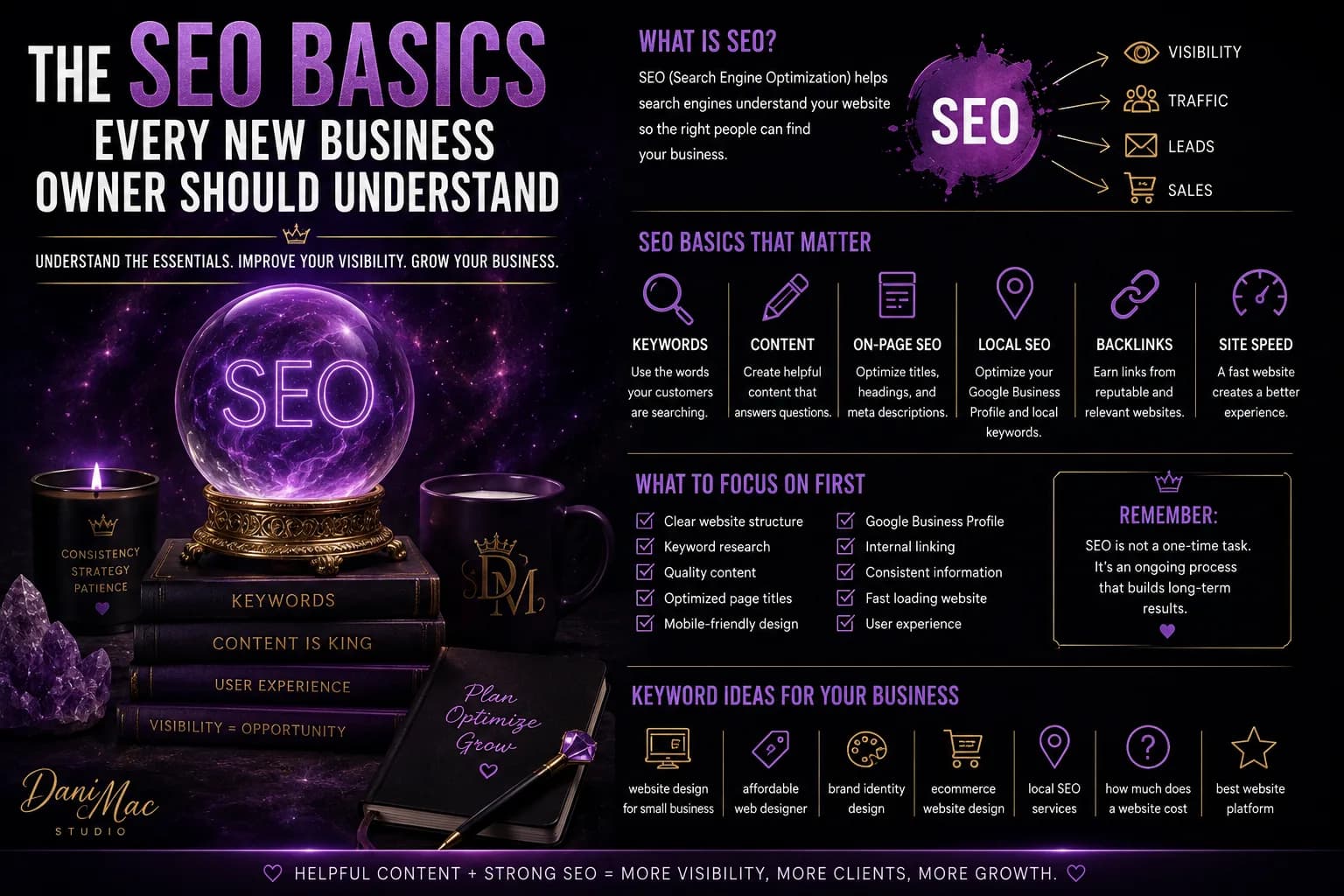
The SEO Basics Every New Business Owner Should Understand
SEO sounds way more complicated than it needs to. This guide breaks down the basics every new business owner should understand so you can make your website easier to find without becoming obsessed with keywords, algorithms, or technical nonsense you do not need yet.
Read article →About Dani Mac
I’m an entrepreneur, designer, digital-product creator, author, and builder of several connected brands. I share what works, what needs testing, and what I would do differently.
Explore my work →